The Mofta
The Mofta had 40 years of work behind it. I wanted the identity to look like it knew that: clear, restrained, and sure of itself.
Brief
The Mofta already had history. Real projects, real buildings, real impact. The receipts were there.
The problem wasn’t credibility. It was clarity.
The work already had presence. The brand system was not carrying it yet. It needed to feel less like a label and more like a signature.
The Shift
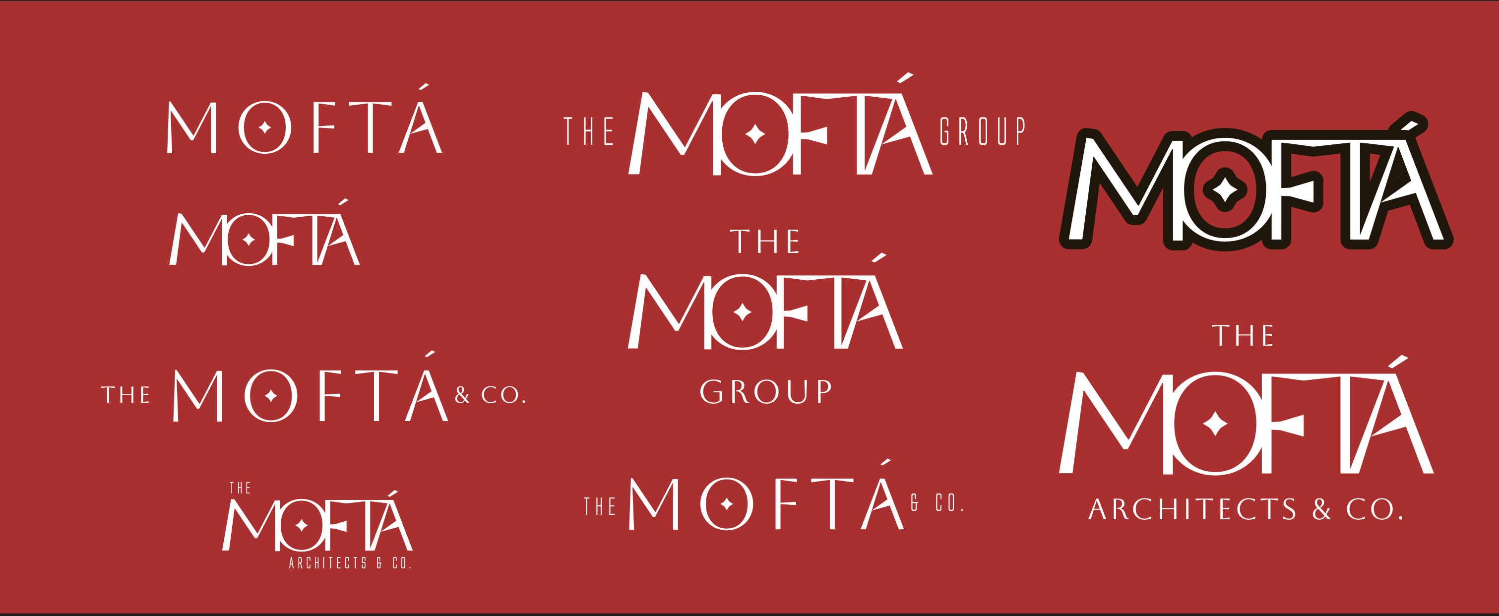
The transition from DE MOFTA → THE MOFTA wasn’t just a rename.
It moved the company from descriptive to definitive. Cleaner, sharper, easier to remember.
“THE” makes it feel singular. Like a standard, not just a name.
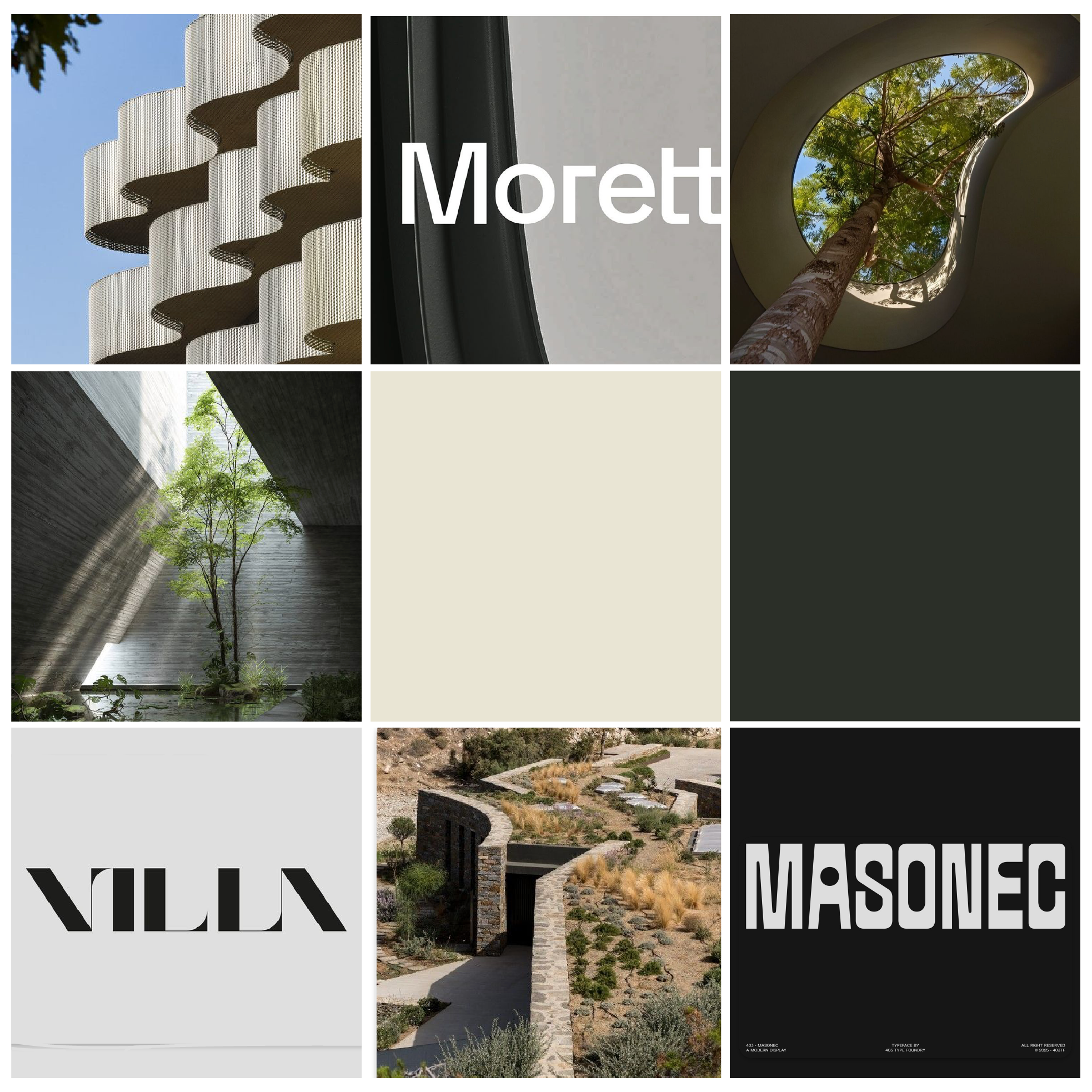
Moodboard
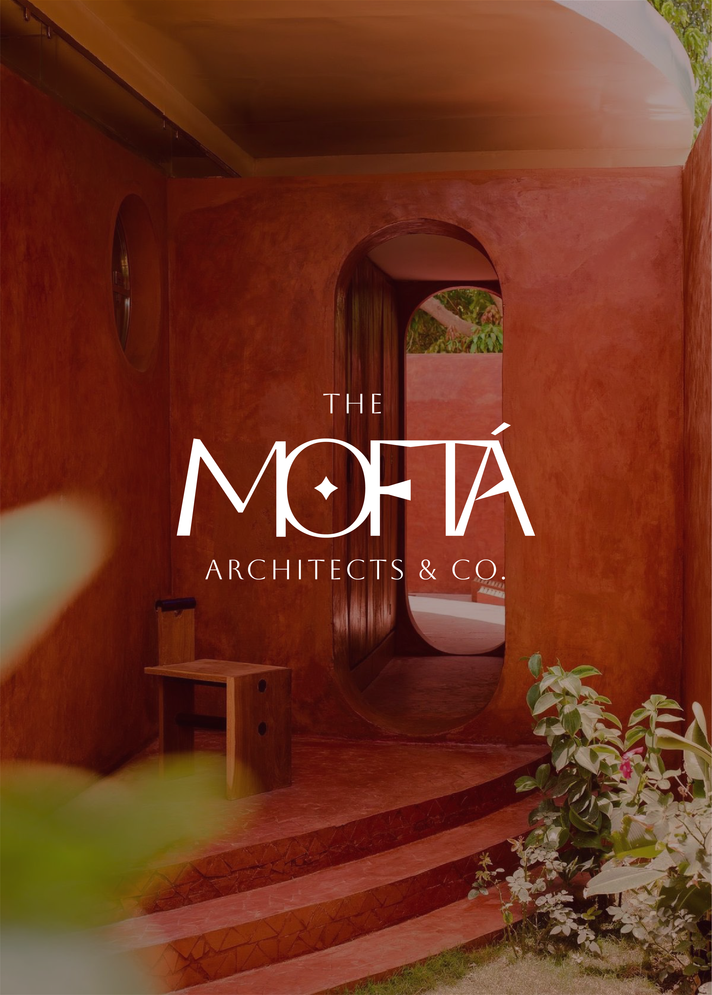
I started with real environments, especially African architecture where material, light, and form already speak to each other.
Earth-built structures and modern tropical spaces gave me a language to work from. I did not want to paste a borrowed mood over the company.
Vibe Check
A lot of architecture brands feel cold or overly corporate.
This needed to feel grounded. Almost tactile.
Like something you can step into, not just look at.
It had to feel at home where it came from, and still grow beyond that.
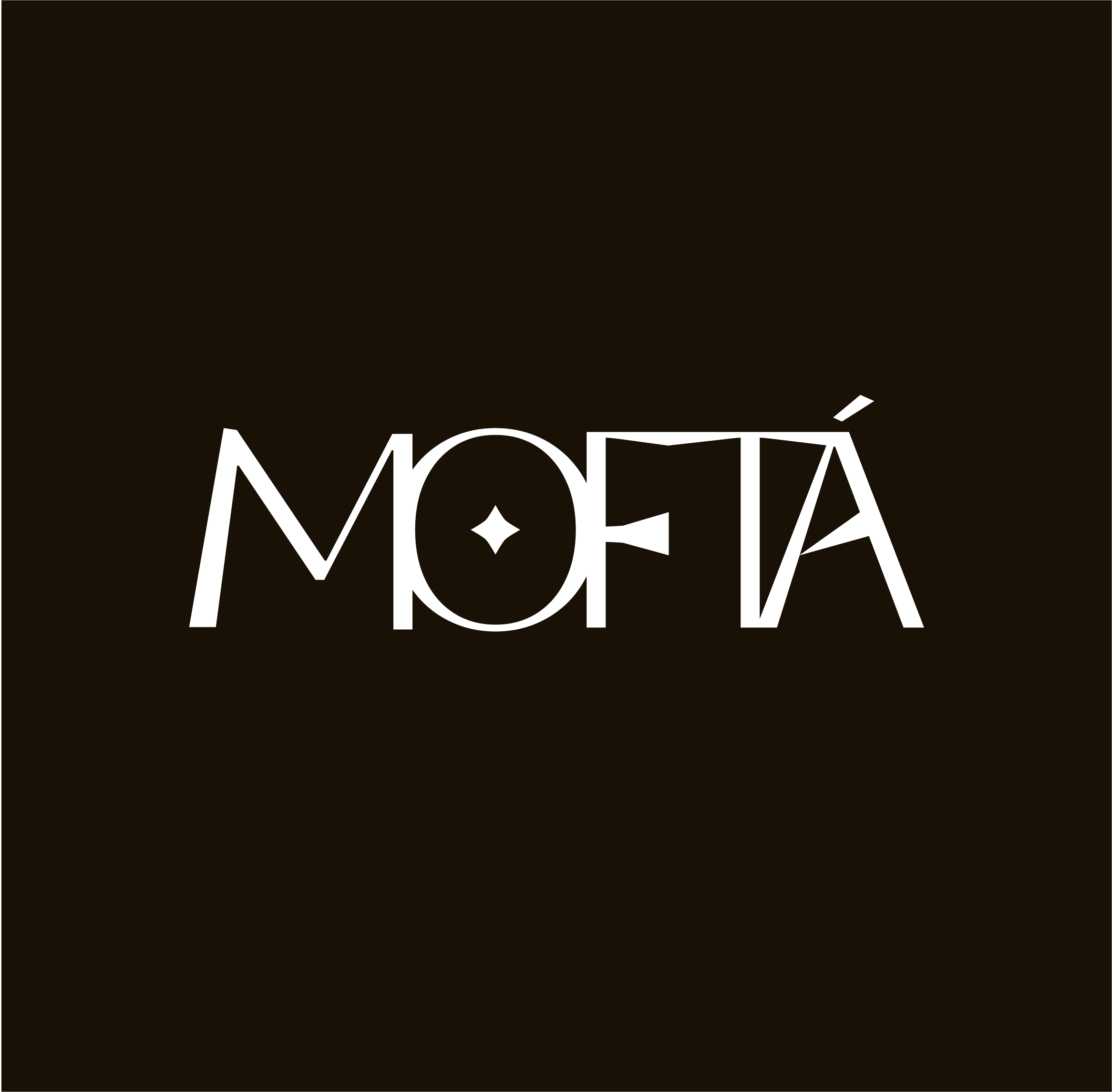
Typography
The wordmark was the hardest part.
It needed to feel architectural without becoming rigid.
I wanted structure without stiffness. The line was thin.
Material
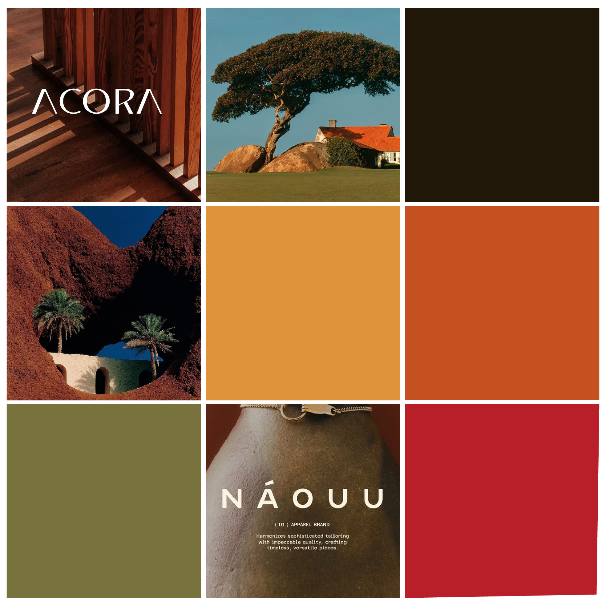
The colour system came from material first, not an “earthy” moodboard shortcut.
Clay, sand, vegetation, and earth tones translated into a structured palette.
Palette — derived from material, not decoration
Identity
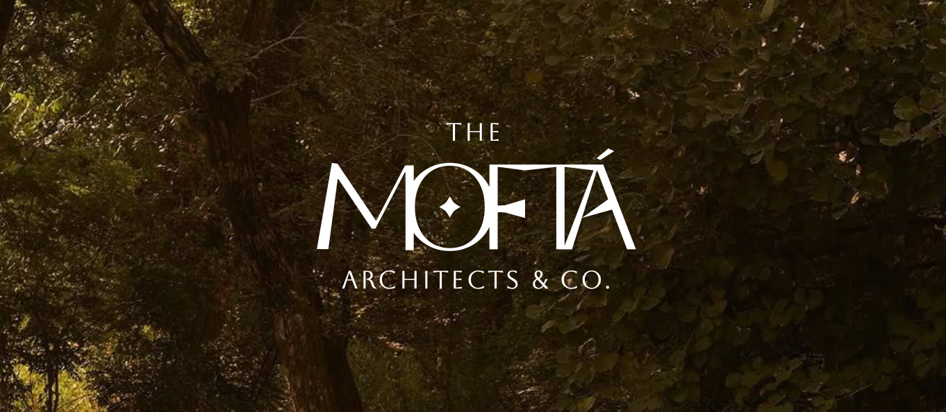
The final mark is minimal, but deliberate.
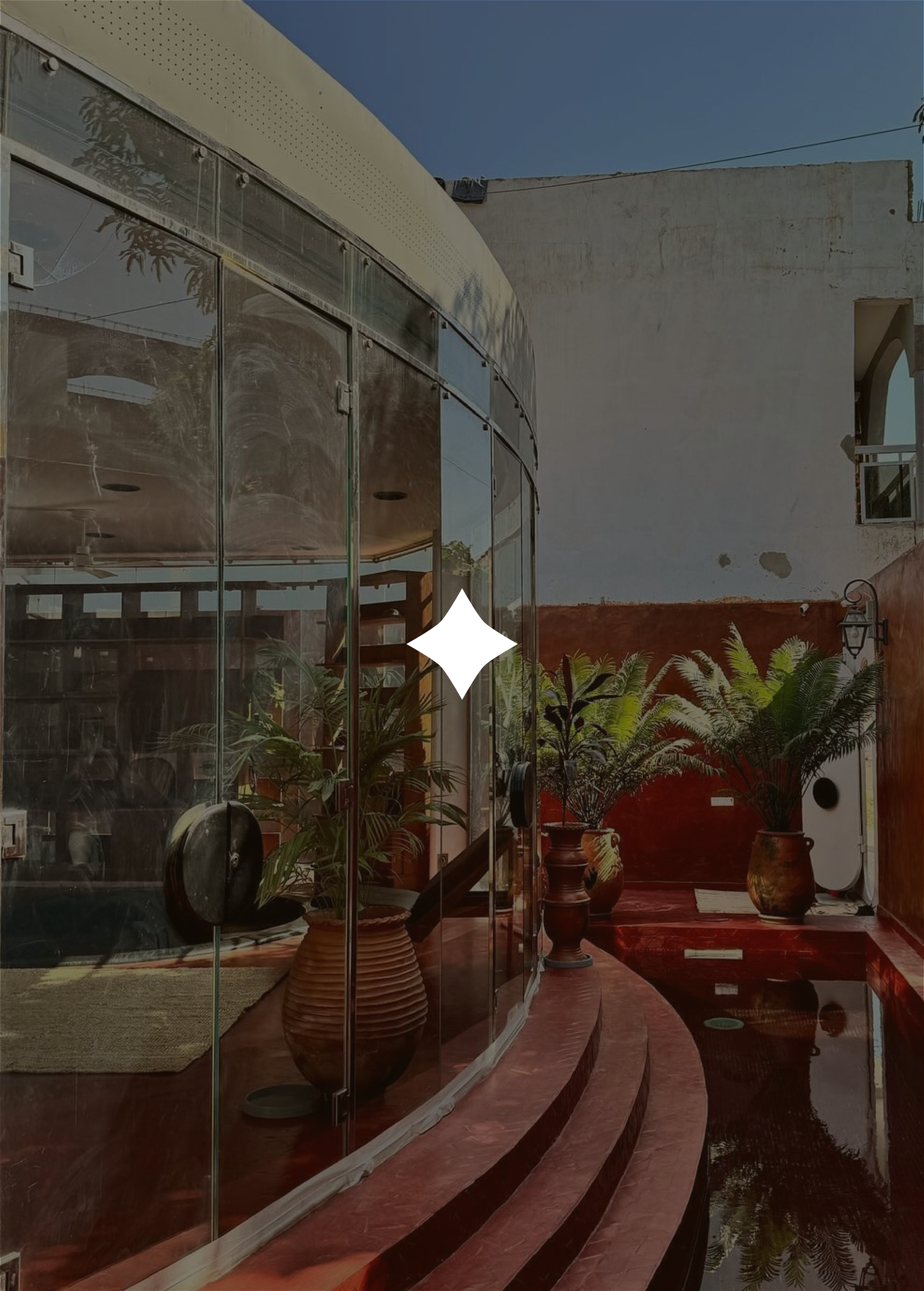
The star becomes a subtle anchor — a point of focus, almost like a marker in space.
Everything else is restraint. It only looks simple after the extra drama is gone.
Geometry
The geometry isn’t perfect on purpose.
Slight tension in the shapes keeps it from feeling generic.
It feels designed, not constructed by default.
Outcome
The result feels closer to what the company actually is: experienced, grounded, and quietly confident.
Not just a legacy firm — but a system.
Something that can grow, adapt, and stay consistent over time.