Au Naturel
Au Naturel is a gallery for photographs I kept coming back to. I was drawn to work that felt raw and close, so the site needed to get out of its way.
I had a list of photographers I followed across Instagram and Patreon. I kept saving the images that stayed with me. At some point the saves wanted a room of their own.
The main design question was small but strict: how do I show expressive photography without making the interface louder than it?
Intent
I wanted a gallery that felt personal and composed, not a template with images poured into it.
So I removed more than I added. Composition, light, and form could do the talking.
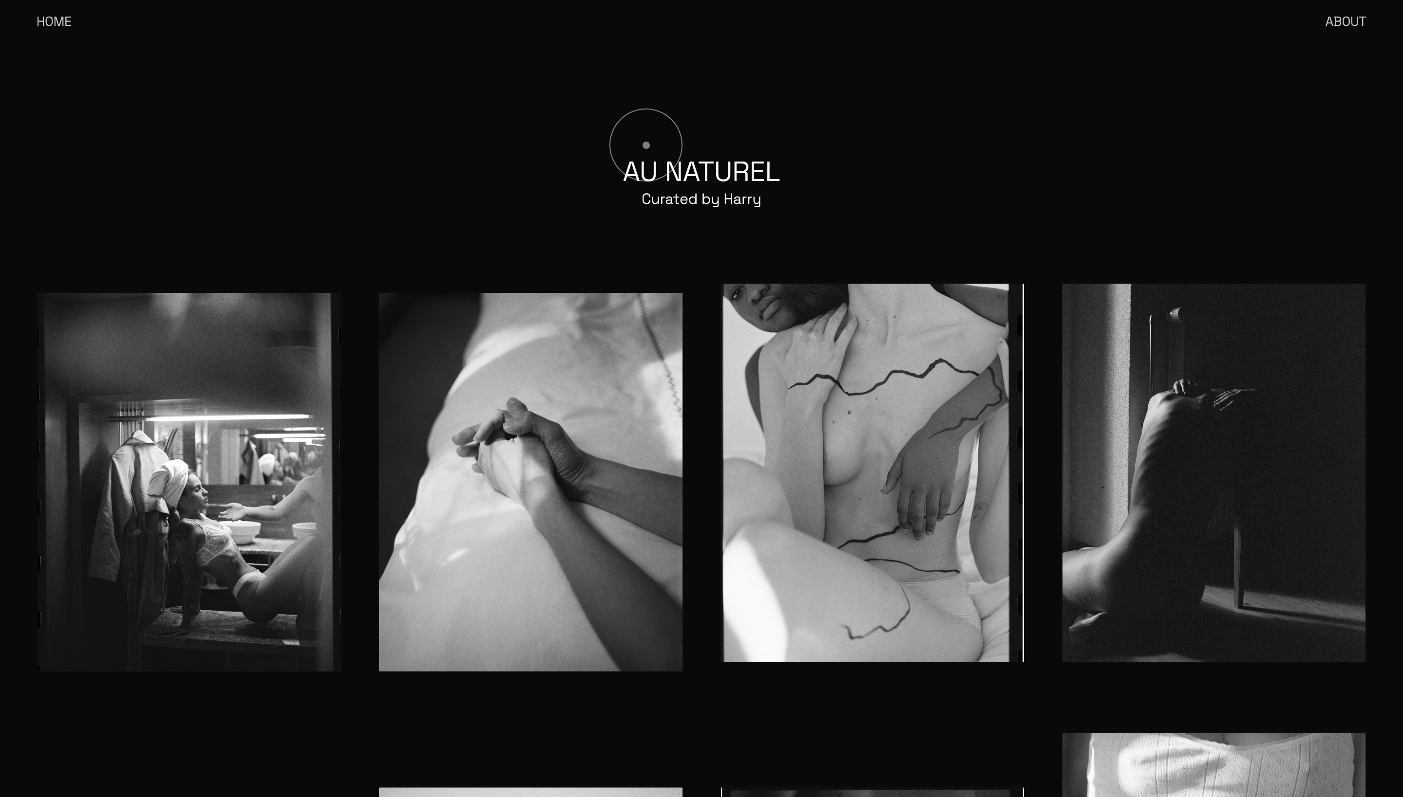
Design System
Controlled asymmetry gave the page its rhythm. Different image sizes and placements kept the scroll from feeling like a catalog.
- Irregular grid structure
- Large negative space
- Muted typography
- Custom reactive cursor
- Dark, neutral palette
Every one of those choices points attention back at the photographs.
Interaction
I kept the interactions quiet. Smooth motion and focus feedback were enough. The cursor did not need a solo.
- Scroll-driven movement
- Hover-based focus feedback
- Soft transitions between states
- Minimal UI interruption
The custom cursor and hover states only help your eye settle.
Motion
I let elements move at slightly different speeds so the page has depth without losing its calm.
Scroll stays fluid and responsive. You set the pace.
Outcome
The result is quiet on purpose. No clutter, no shouting, just enough structure for the work to land.
This project taught me that restraint can still have a point of view.
Credits
Featuring selected works from photographers I was following and collecting from at the time.
Stack
- Vue.js
- TailwindCSS
- GSAP
- Locomotive Scroll
- SASS