Stickies
Stickies is a note app for thoughts that do not want to line up neatly. Notes sit on a board like little objects, which came from my love for the Apple Mac Stickies app.
Context
I built it while learning Vue 3. A plain tutorial app would have worked, but I wanted something I could care about while building it.
I kept coming back to the Apple Mac Stickies app and the feeling of notes living on your screen instead of inside rows. Most note apps lean into order. I wanted a surface you could drop a thought onto and leave a little messy.
The main move is simple: click the board and a note appears there.
That one decision shaped everything else. You think in space, not in a form.
Interactive Demo
I rebuilt one note here in React so you can feel the part I cared about. Drag it, recolor it, favorite it, delete it, bring it back.
Stickies makes more sense once the note moves.
Interaction Model
I wanted each note to behave like a movable object, not a card wearing a sticky-note costume. Click to create. Drag from the handle. Let the controls appear when you need them.
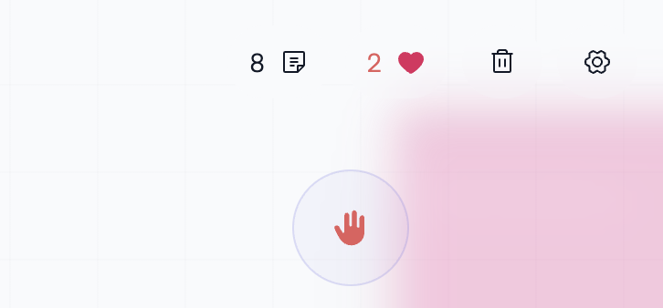
The controls stay small, but they give the board life. A note can change color, move to the top, become a favorite, or disappear.
I liked the contrast too: a calm landing page, then a board you step into.
Design Direction
A yellow card is not automatically a sticky note. I wanted brightness, tactile edges, a little mess, and enough depth to make the board feel touched.
That showed up in the square proportions, paper colors, stacked depth, visible drag handle, and controls that wait for hover. The board gets its own surface treatment so notes feel placed, not boxed in.
Color mattered too. Recoloring a note lets the board slowly become yours.
From Note to System
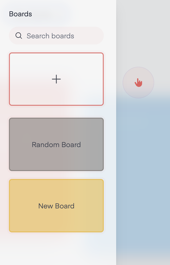
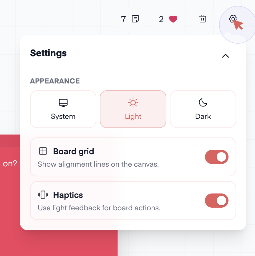
The one-note idea grew up a little: multiple boards, search, favorite focus, theme and grid settings, haptics, and a clearer header.
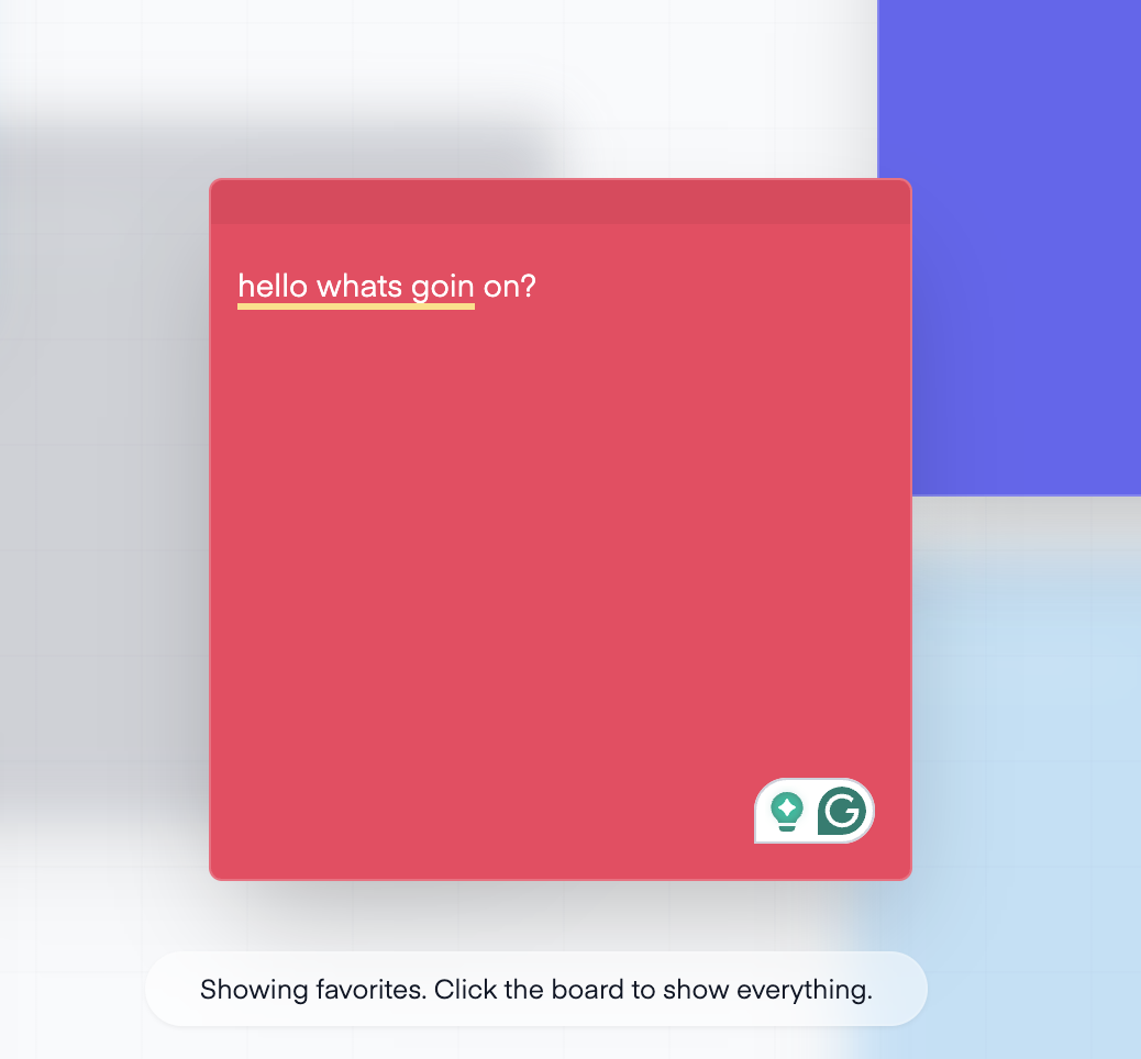
Favorites became the most useful addition. Focus mode lets loved notes stay sharp while the rest fall back, without sending you to another screen.
The settings are small, but together they make the board feel personal. Haptics were especially fun because tiny actions get a tiny physical answer.
Underneath, it stays straightforward. Vue 3 renders it, Pinia holds state, localStorage keeps it around, and each note stores content, coordinates, color, and loved state.
I also wired in Electron so it could live closer to the desktop thing that inspired it.
Reflection
Stickies is small, but it captures something I care about in side projects: the interface should have a point of view.
It gave me a real product to learn Vue with, state to manage, persistence to wire up, and interaction details worth fussing over.
More than anything, it reminded me that small tools can still have character. They do not need to be huge to feel designed.