Moments Home Feed
How can one post contain several media frames while the feed stays easy to use?
I redesigned the home feed around ordered media frames, direct gestures, replies, and stable navigation. Each visible control has a clear role in the feed.
The Product Question
The feed had to support several media frames in one post. It also had to keep each swipe predictable.
- Several media items had to feel like one post.
- Nested gestures needed clear and predictable ownership.
- Top and bottom navigation needed clear roles.
- The reply field had to stay visible above the keyboard.
I treated these problems as one UX system. A visual decision could change motion, layout, or input.
The evidence comes from working prototypes and implementation tests. This study does not claim formal usability research or launch metrics.
Familiar Patterns, Different Product
I studied how people swipe, reply, save, and view visual media in other products.
I used a familiar pattern when it met the same need. I changed the pattern when Moments required different behavior.
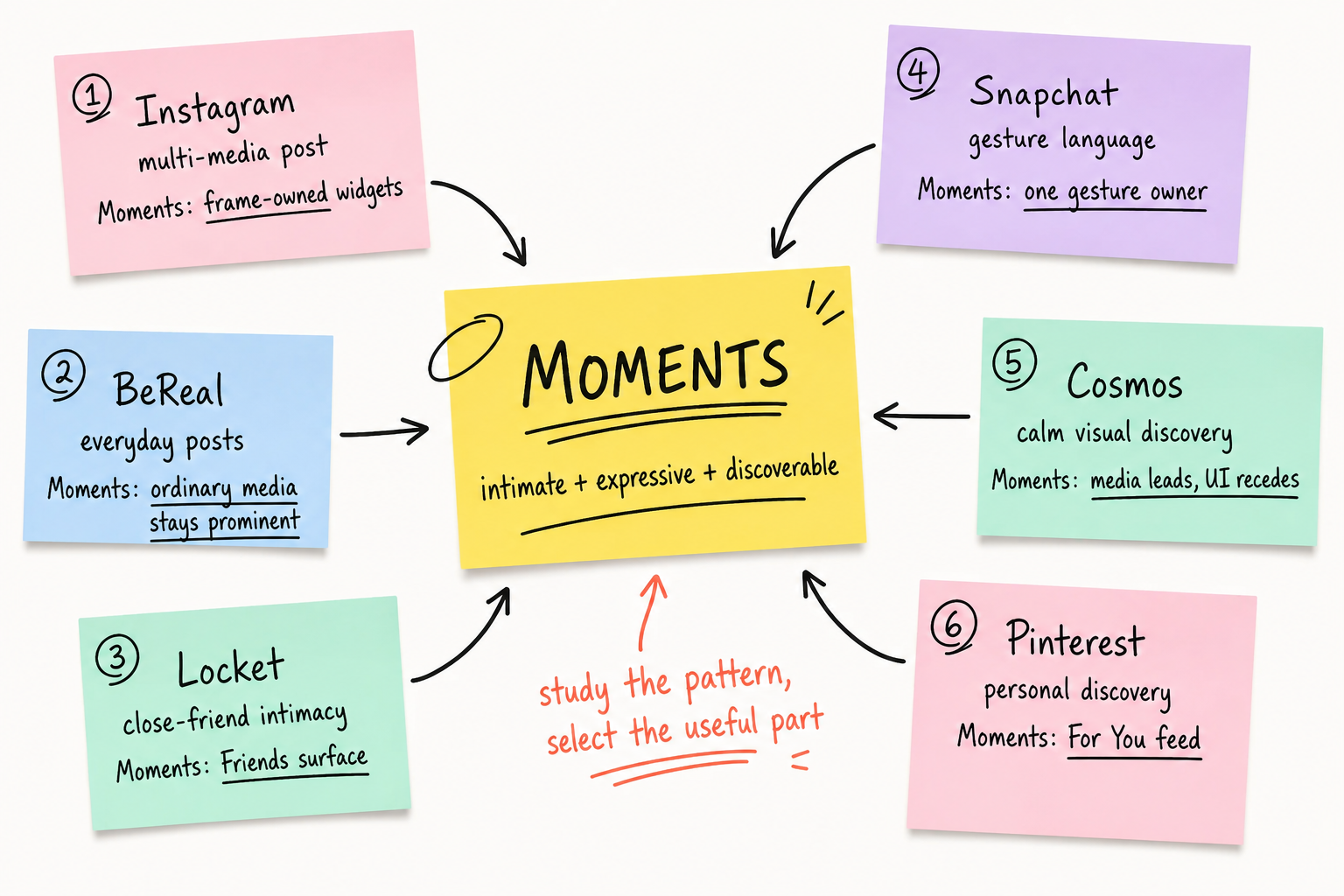
 Instagram
Pattern I learned
One post can hold several media items. Likes and replies still belong to the complete post.
My decision
Moments uses ordered media frames. Side peeks show that another frame is available.
 BeReal
Pattern I learned
A daily prompt and a short capture window make ordinary moments the subject.
My decision
Moments keeps ordinary media prominent without a forced capture window.
 Locket
Pattern I learned
Close-friend sharing can feel valuable without public follower counts or heavy engagement metrics.
My decision
Moments reserves a Friends feed mode for close relationships. The current prototype uses example data.
 Snapchat
Pattern I learned
Gestures can move media, open app areas, and support direct replies without permanent controls.
My decision
Moments gives each nested gesture one owner. A frame swipe cannot also move the app page.
 Cosmos
Pattern I learned
Calm visual discovery can focus on taste, source context, and content instead of performance.
My decision
Media leads the Moments feed. Controls recede, while creator context stays attached to the post.
 Pinterest
Pattern I learned
Follows, boards, engagement, searches, and hides shape the home feed.
My decision
Moments uses a For You feed mode to make personal discovery clear.
Problem: One Image Did Not Support a Media Sequence
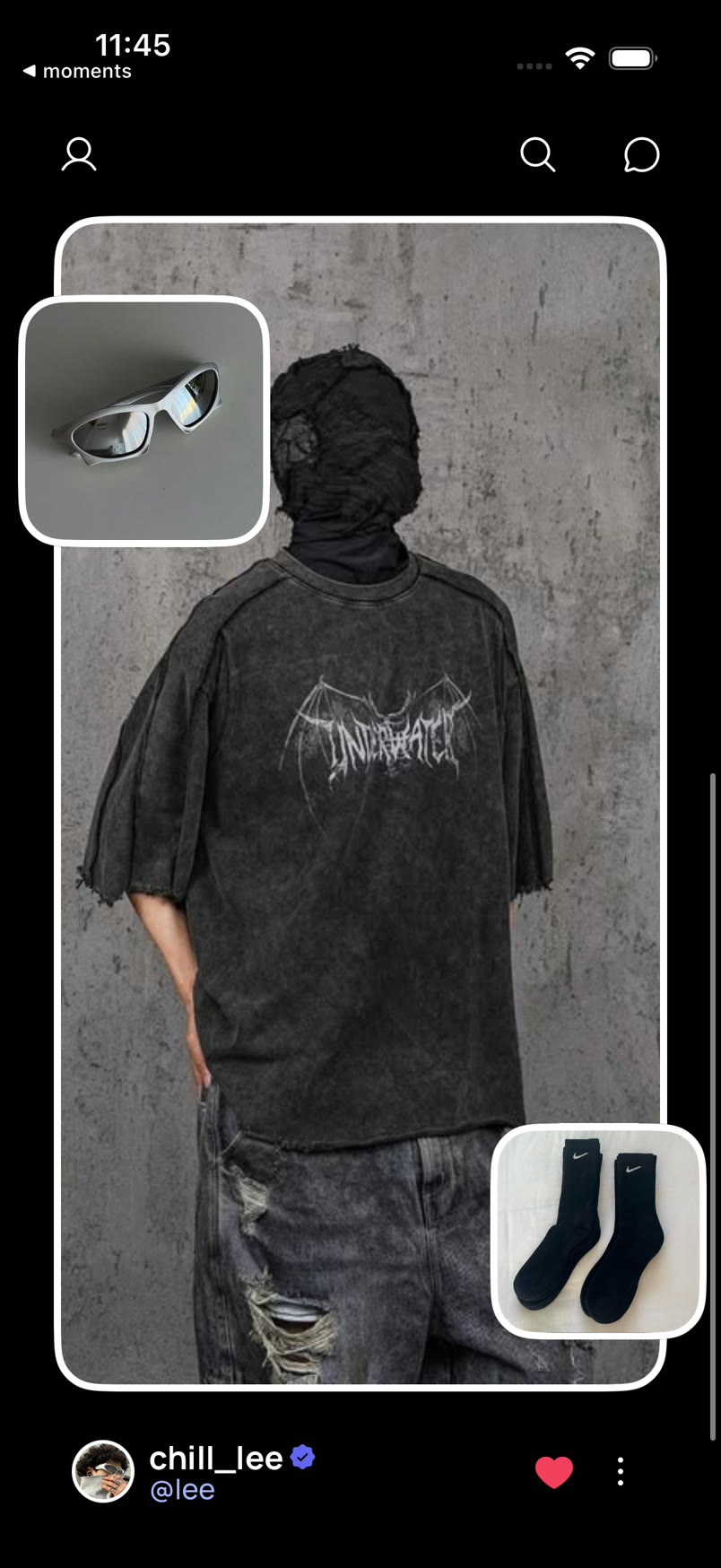
The 2024 feed used one photo as the post background. Floating photo widgets added more photos to the post.
This model kept the feed simple. However, one base photo could not support an ordered sequence of photos and short videos.
A tap expanded a photo widget from its position. I kept this direct transition in the new model.
Decision: A Media Deck Inside Each Post
I changed the post from one image into an ordered media deck. A vertical swipe still changes the complete post.
A horizontal swipe inside the post changes the media frame. This keeps the vertical post gesture and adds a horizontal frame gesture.
I kept frame movement on an Animated.ScrollView instead of rebuilding scroll physics with a custom pan. snapToInterval uses the card width and gap as one step, while decelerationRate="fast" lets native momentum settle the nearest frame.
const frameScrollGesture = pagerGesture
  ? Gesture.Native().blocksExternalGesture(pagerGesture)
  : Gesture.Native();

const onScroll = useAnimatedScrollHandler({
  onScroll: (event) => {
    scrollX.value = event.contentOffset.x;
  },
});

<GestureDetector gesture={frameScrollGesture}>
  <Animated.ScrollView
    horizontal
    snapToInterval={step}
    decelerationRate="fast"
    onScroll={onScroll}
  />
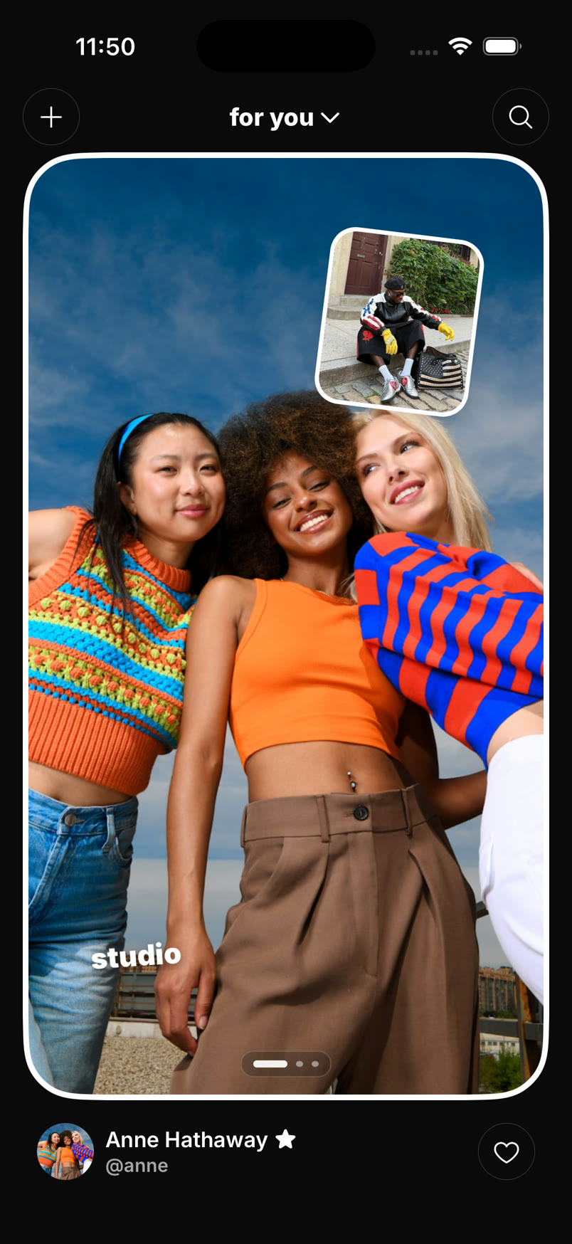
</GestureDetector>The first version kept the old white border. It verified the gesture structure. However, the border made the deck look like one image.
Problem: The Deck Needed Clear Position Feedback
The interface had to show that the post contained more media frames. Dots showed the frame position, but they did not show adjacent frames.
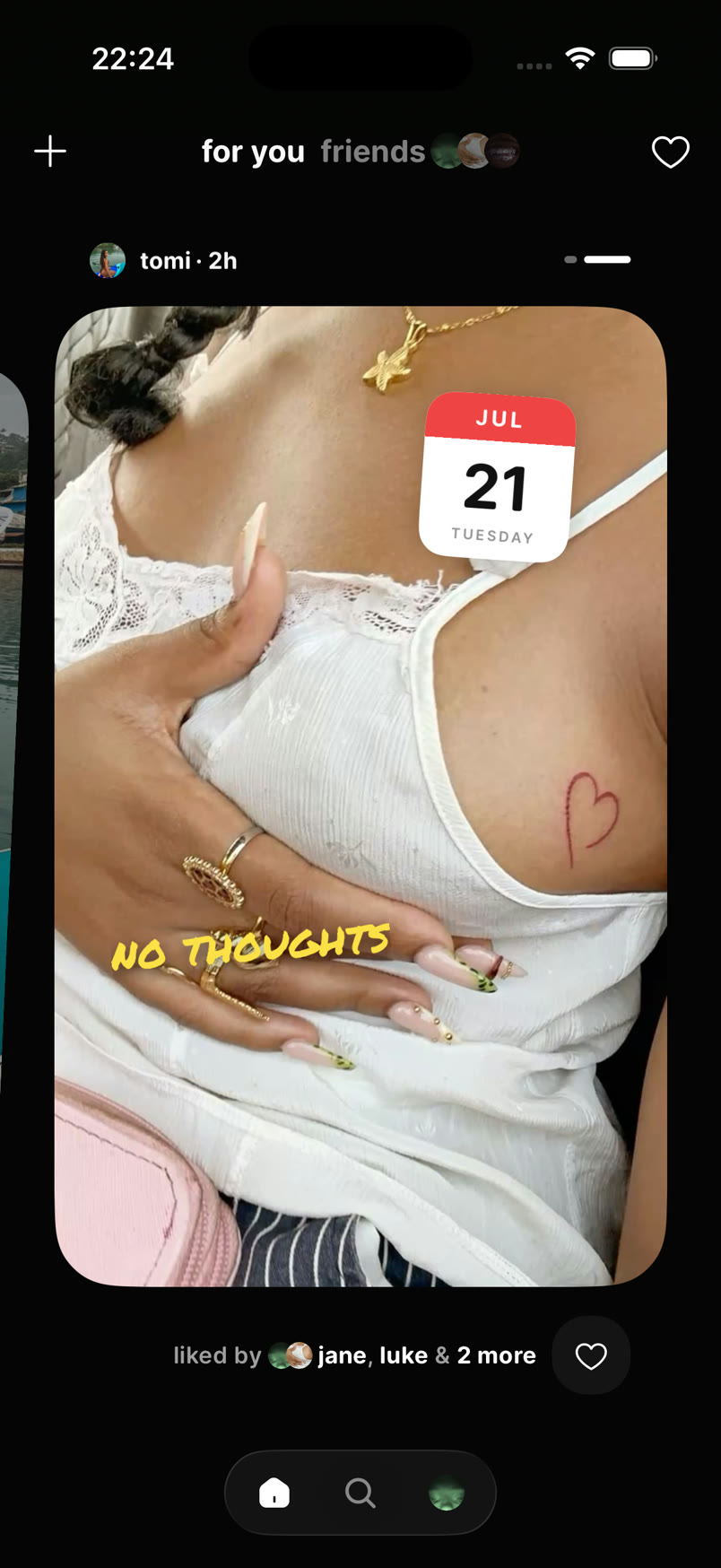
I removed the outer frame and exposed the adjacent media frames. The side peeks show that a person can swipe to another frame.
Inactive frames use a smaller scale, slight rotation, and lower opacity over black. This treatment does not make the media white.
The animated rail shows the exact frame position. The frame styles show which frame is active. Both use the same live scroll position.
useAnimatedScrollHandler() copies contentOffset.x into the scrollX shared value. Each DeckFrame and ProgressSegment reads that same value through useAnimatedStyle(). interpolate() maps the scroll position to opacity, z-index, scale, rotation, and rail width without a React render on every scroll frame.
const inputRange = [
  (index - 1) * step,
  index * step,
  (index + 1) * step,
];
const flatten =
  1 - Math.min(keyboard.height.value / KEYBOARD_SETTLE_HEIGHT, 1);

const animatedStyle = useAnimatedStyle(() => ({
  opacity: interpolate(
    scrollX.value,
    inputRange,
    [0.55, 1, 0.55],
    Extrapolation.CLAMP,
  ),
  transform: [
    {
      scale: interpolate(
        scrollX.value,
        inputRange,
        [0.9, 1, 0.9],
        Extrapolation.CLAMP,
      ),
    },
    {
      rotate: `${interpolate(
        scrollX.value,
        inputRange,
        [-2.5, 0, 2.5],
        Extrapolation.CLAMP,
      ) * flatten}deg`,
    },
  ],
}));I separated the transformed media layer from the widget layer. The image can scale and rotate inside its clipped card, while widgets stay in an absolute, overflow-visible sibling above it. I explicitly set shouldRasterizeIOS and renderToHardwareTextureAndroid to false on the widget layer. It stays live and crisp instead of becoming a cached bitmap during a deck movement.
<Animated.View style={[styles.mediaLayer, mediaStyle]}>
  {children}
</Animated.View>

<View
  pointerEvents="box-none"
  renderToHardwareTextureAndroid={false}
  shouldRasterizeIOS={false}
  style={styles.widgetLayer}
>
  {overlay}
</View>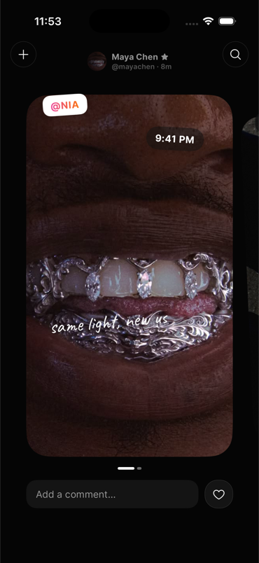
Problem: Nested Swipe Gestures
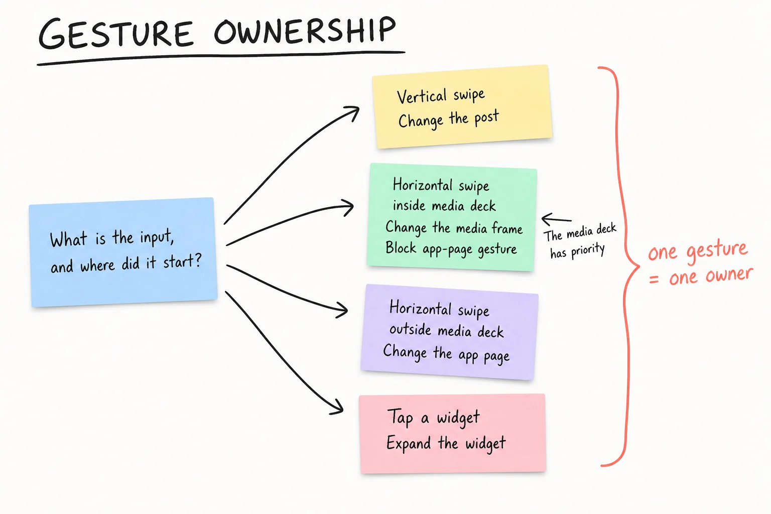
The app has horizontal app pages. Each post has a horizontal media deck. The feed moves vertically between posts.
Without a clear rule, one horizontal swipe could change the media frame and the app page.
A horizontal swipe inside the media deck changes the frame. The media deck blocks the app-page gesture.
A horizontal swipe outside the media deck changes the app page. A vertical swipe changes the post.
The frame deck wraps its scroll view with Gesture.Native().blocksExternalGesture(pagerGesture). This gives the native scroll recognizer priority inside the deck. The root pager is a separate Gesture.Pan() with activeOffsetX([-20, 20]) and failOffsetY([-15, 15]). The vertical feed remains another Animated.ScrollView that snaps by the viewport height.
Problem: The Keyboard Replaced Half the Feed
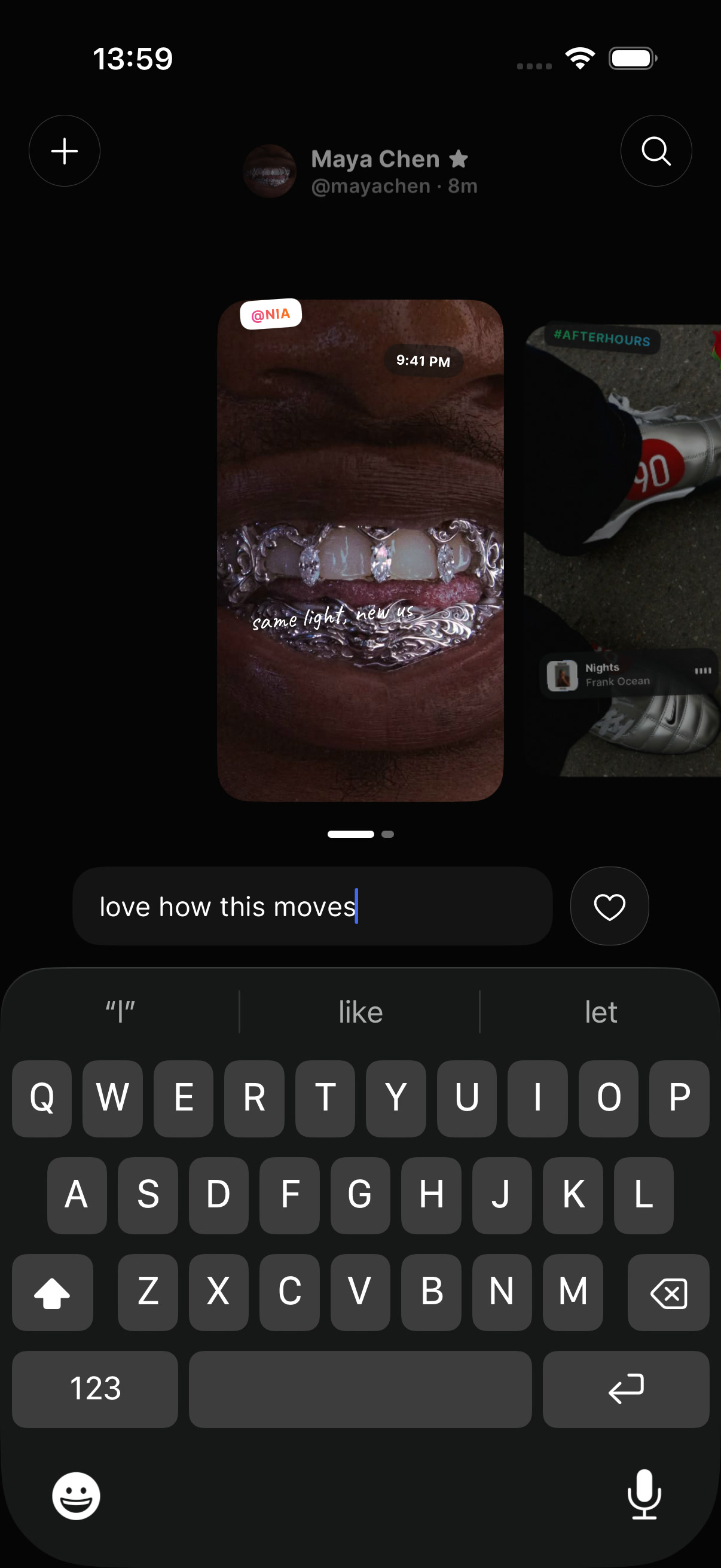
The reply keyboard reduced the available height. A fixed deck could hide the reply field or move the active frame off the screen.
I used the keyboard height as a layout value. The deck became a 280-pixel strip while the reply field had focus.
useAnimatedKeyboard() exposes the keyboard height as a shared value. useAnimatedStyle() maps that value to the deck height and reply-field position, so both move together on the UI thread. useState() still tracks the durable input state, but it does not drive each intermediate keyboard frame.
The reply field stayed above the keyboard. A downward drag closed the keyboard and restored the full deck height.
The current feed does not show this reply field. I kept the test because it shows how the feed responded to a major layout change.
Decision: Expand a Widget from Its Source
A separate details page would hide the source position of a photo widget. The transition must show this position.
The expanded view starts at the measured widget bounds. It then moves from that position to the full screen.
A useRef<View>() on MomentCanvas calls measureInWindow() when a widget is pressed. The overlay measures its final rendering the same way, then combines the canvas frame with the widget's normalized x and y values. withSpring() opens from the derived translation, scale, and rotation. withTiming() retraces the same path when it closes.
node.measureInWindow((finalX, finalY, finalWidth, finalHeight) => {
  const sourceX = origin.x + element.transform.x * origin.width;
  const sourceY = origin.y + element.transform.y * origin.height;

  startTranslateX.value =
    sourceX + (finalWidth * ratio) / 2 - (finalX + finalWidth / 2);
  startTranslateY.value =
    sourceY + (finalHeight * ratio) / 2 - (finalY + finalHeight / 2);
  progress.set(withSpring(1, {
    damping: 19,
    mass: 0.85,
    stiffness: 200,
  }));
});
When a person closes the view, the photo returns to the same media frame. This motion connects the expanded photo to its source.
Problem: Hidden App Pages Increased Gesture Load
The 2024 app used horizontal swipes to move between New Post, Feed, and Messages. It did not show a persistent navigation bar.
This design left more space for media. However, it hid the available app pages and required a learned gesture.
A later version added a floating bottom bar for the same pages. Its active indicator moved with the root pager.
The app pager and media deck used the same horizontal axis. A frame swipe had to block the app-page swipe.
The root pager resolves a page from two concrete signals in onEnd: a horizontal velocity above 500 points per second or a drag beyond 30 percent of the viewport width. withTiming() then settles translateX on the selected page.
Decision: Give the Top and Bottom Bars Different Roles
An earlier top bar showed the active creator. The title changed when the post changed, so app controls and post data shared one area.
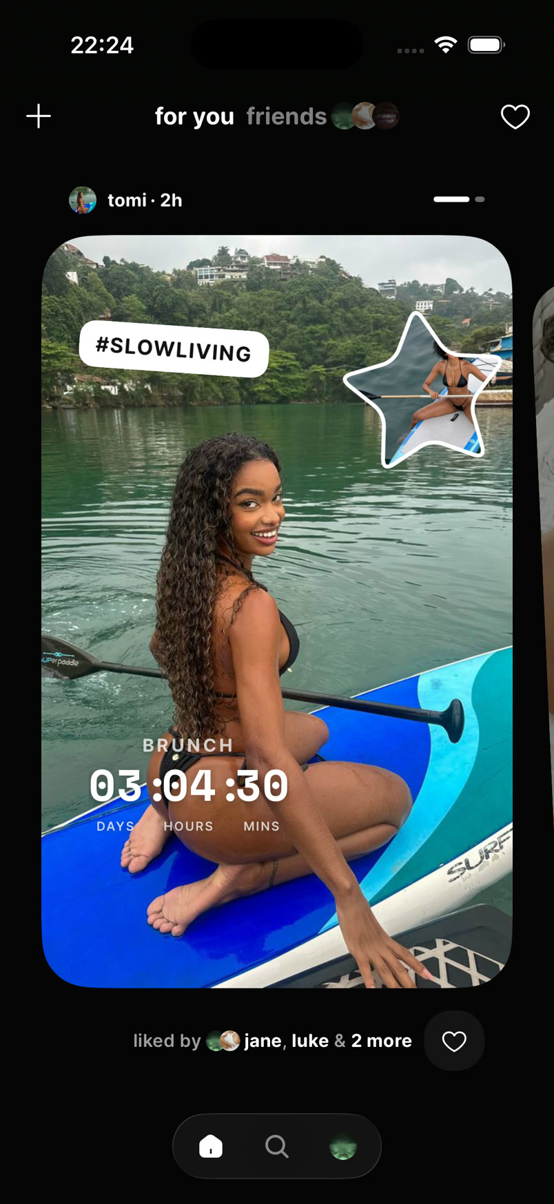
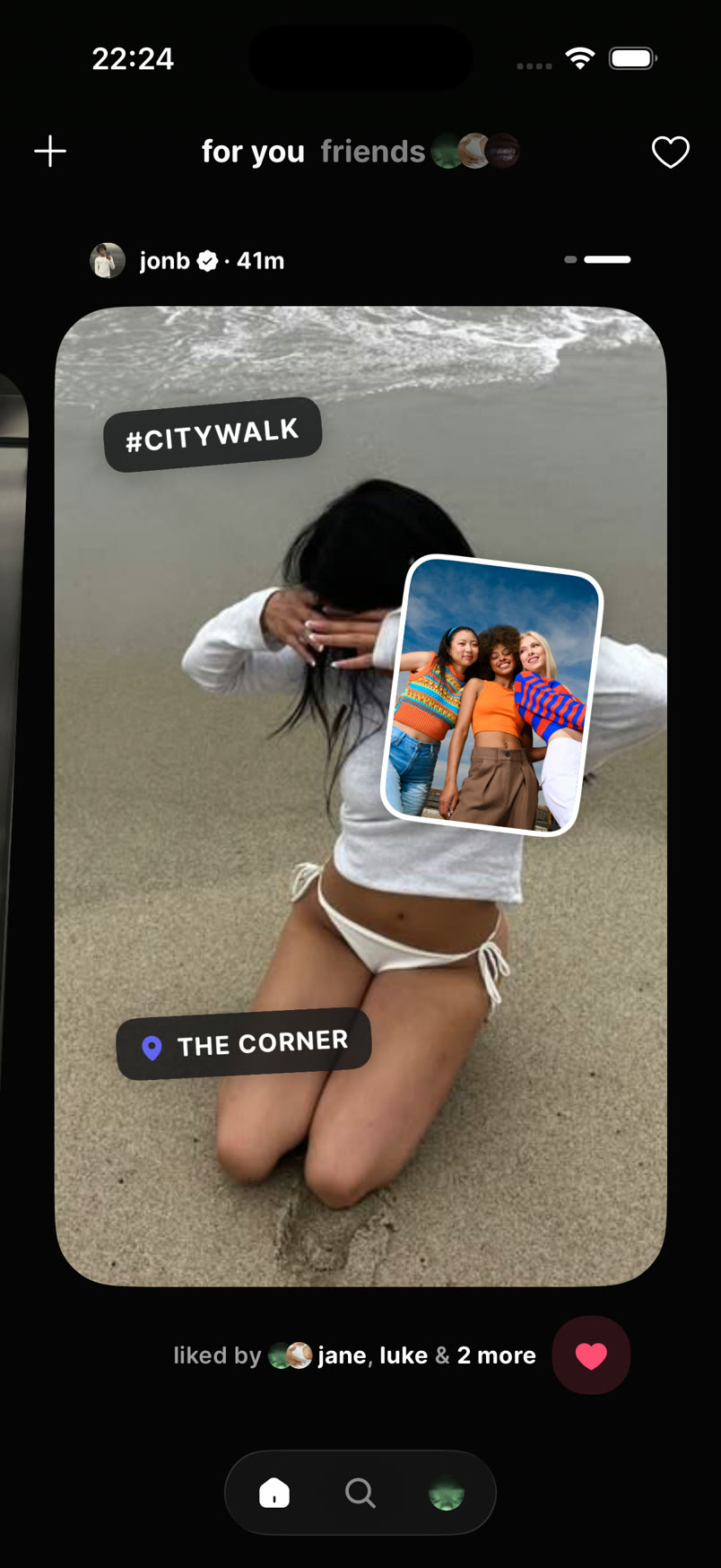
I moved creator data and frame progress into each post. The top bar now controls the feed. It contains Create, For You, Friends, and Notifications.
The floating bottom bar controls app destinations. It contains Home, Search, and Profile. Create moved to the top bar, so the bottom bar only shows persistent destinations.
The Create page opens from the left side of the root pager. The bottom bar becomes hidden on this page.
A dark-to-transparent gradient protects the top controls above changing media. It keeps contrast without placing a solid bar over the post.
The Current Home Feed
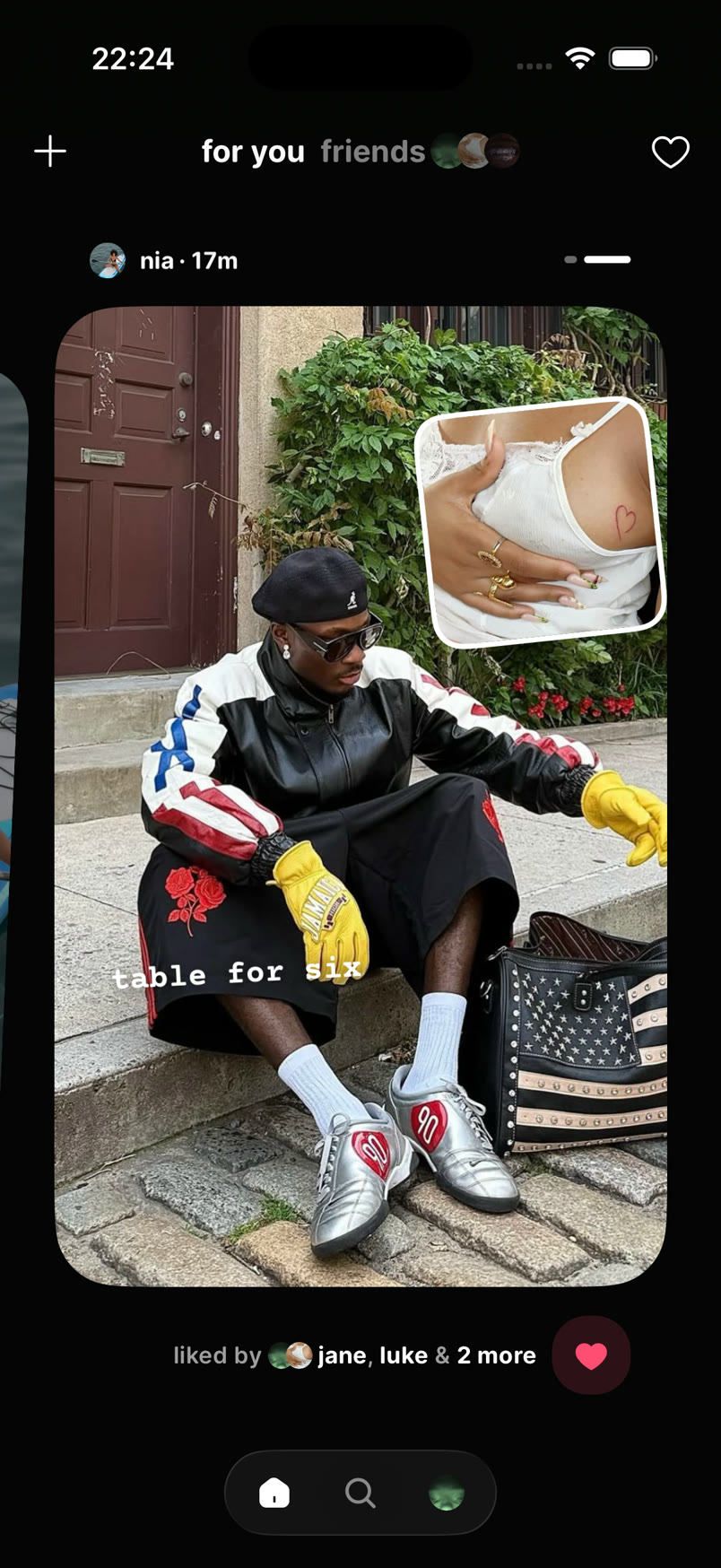
The current media deck uses a 1:1.6 ratio. This leaves space for creator context, progress, social proof, and app navigation.
The top bar stays in place when the post or media frame changes. The creator row stays attached to its post.
I used the Instagram post structure as a reference. Moments adds visible side frames, frame-owned widgets, and separate feed modes.
Current Scope
The interface uses example posts. For You and Friends change visual state, but both controls show the same example data.
Likes use local state. The Notifications control has no action in the current prototype.
Example videos do not play in the feed. Creator profiles do not use live data.
Feed images render with Image from expo-image. The composer already previews selected video with useVideoPlayer() and VideoView from expo-video, but I have not connected that playback path to the current feed fixtures.
What This Work Changed
The main design decision was not the shape of the media deck. It was the rule that gives each movement and control one owner.
Each app page, post, media frame, widget, reply field, and navigation control has a defined role.
I tested the interaction rules before I changed the visual details. This made each later visual decision easier to assess.
The next feed test will use real posts and videos. It will verify the same gesture and navigation rules.