Timed
I made this identity concept while working at Timed as a software engineer. I kept wondering what the product could feel like if the brand leaned harder into presence and immediacy.
Context
I was close to the product in code, which made the visual question hard to ignore.
Timed should work, of course. I also wanted it to feel alive in the moment.
So I explored it through identity, type, colour, and art direction.
The Idea
Most social products are built to keep everything.
I wanted Timed to feel different. More immediate. More alive.
The thought I kept coming back to was simple:
What if moments felt more valuable because they disappear?
That became the identity’s center.
Creative Direction
I did not want corporate polish or visual chaos.
The useful middle was expressive, modern, energetic, and still controlled.
Digital and young, without chasing every trend in the room.
Clarity, motion, contrast, and presence did the work.
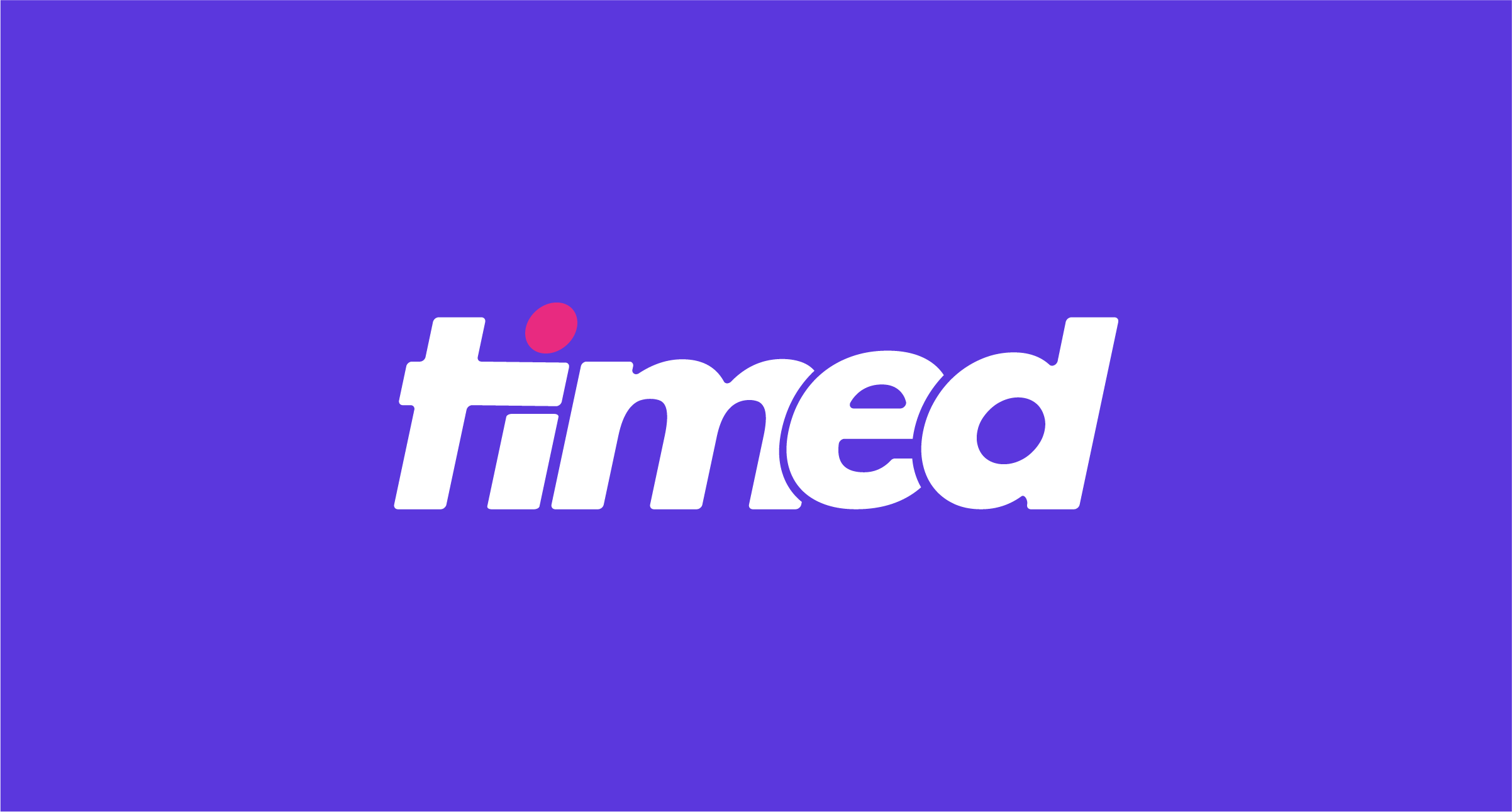
Logo Concept
The logo was designed around the platform’s core mechanic: time.
The custom “t” borrows from clock hands, so time is already inside the wordmark.
The pink dot above the “i” acts almost like a live indicator.
A tiny dot can carry a live feeling if you let it.
I wanted the mark to look simple first, then reward a closer look.
Typography
I chose Aeonik because it balances structure with warmth.
The geometry is precise, but the roundness keeps it human.
It can be confident without shouting over the product.
Colour System
The palette was built to feel digital, expressive, and active.
Timed Purple anchors it. Moment Pink wakes it up.
The tension between them gives the brand energy without asking every surface to perform.
Palette — designed around contrast, energy, and immediacy
Identity System
The logo was only one piece. I wanted a system.
It had to travel through app surfaces, social posts, marketing, and motion.
Strong contrast and low noise kept it recognizable.
Outcome
This concept was never about redesigning the platform officially.
It was my own way of asking how Timed could show presence and temporary connection visually.
I wanted youthfulness with structure, expression without noise, and a modern feeling that did not depend on trends.
Mostly, it let me work in the space between product thinking and visual identity while I was already living close to the platform.
Credits
Typeface — Aeonik by CoType Foundry
Photography — Leire Cavia for Unsplash+